
YEAR: 2021
*T/N: THIS IS A STUDENT PROJECT.

venus LOgo.

eyelash curler box packaging finished art.
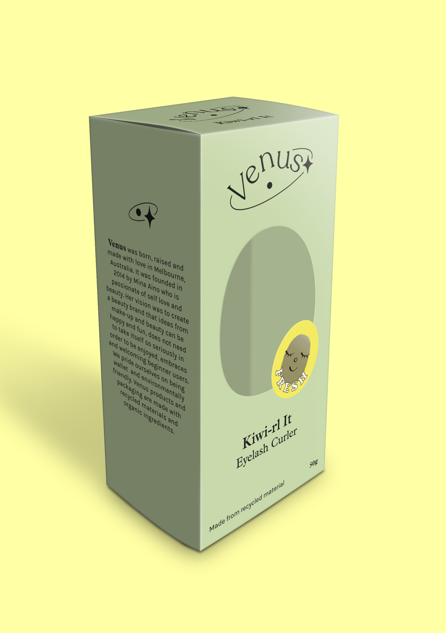
eyelash curler packaging mock-up.
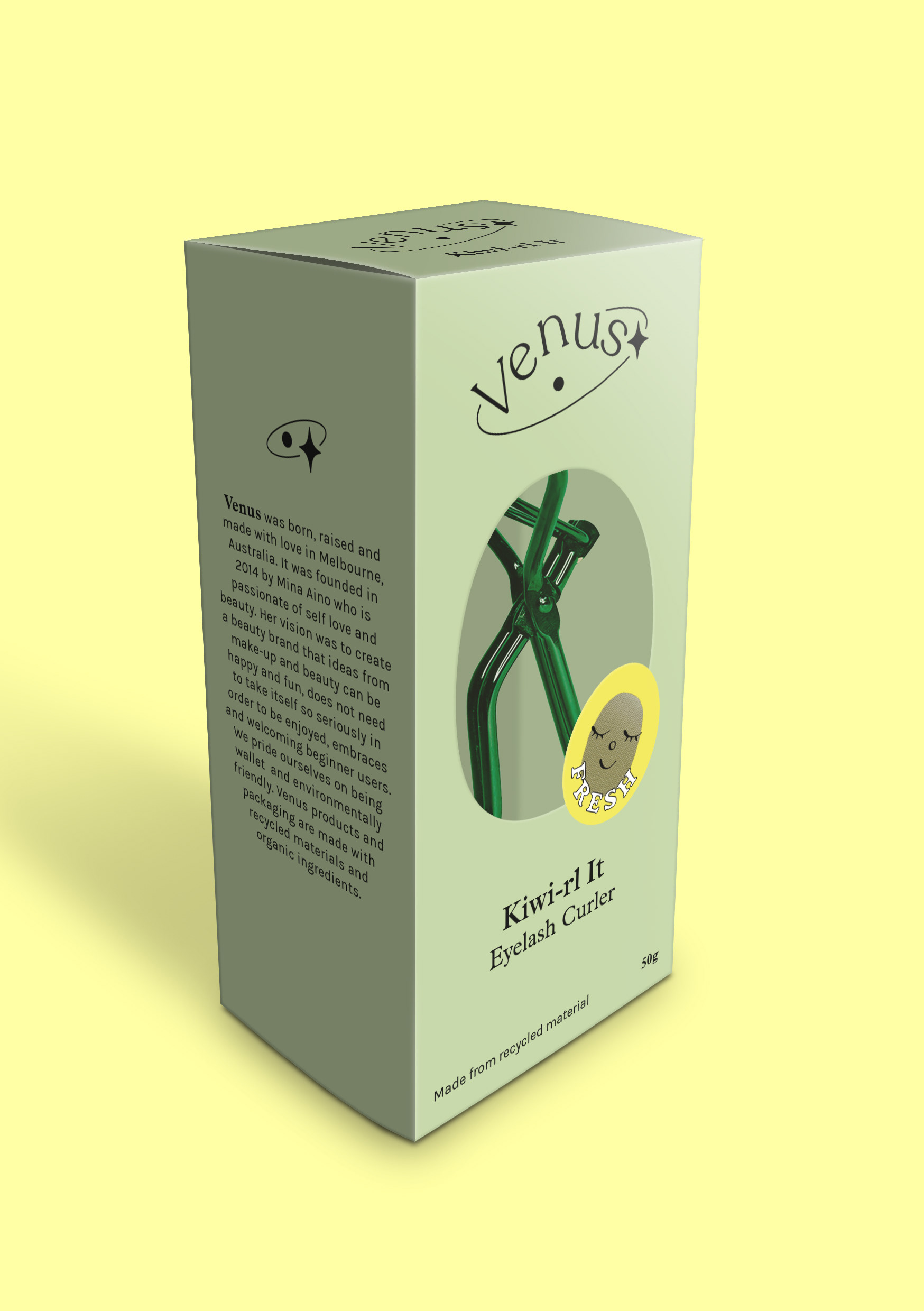
mock-up with product.
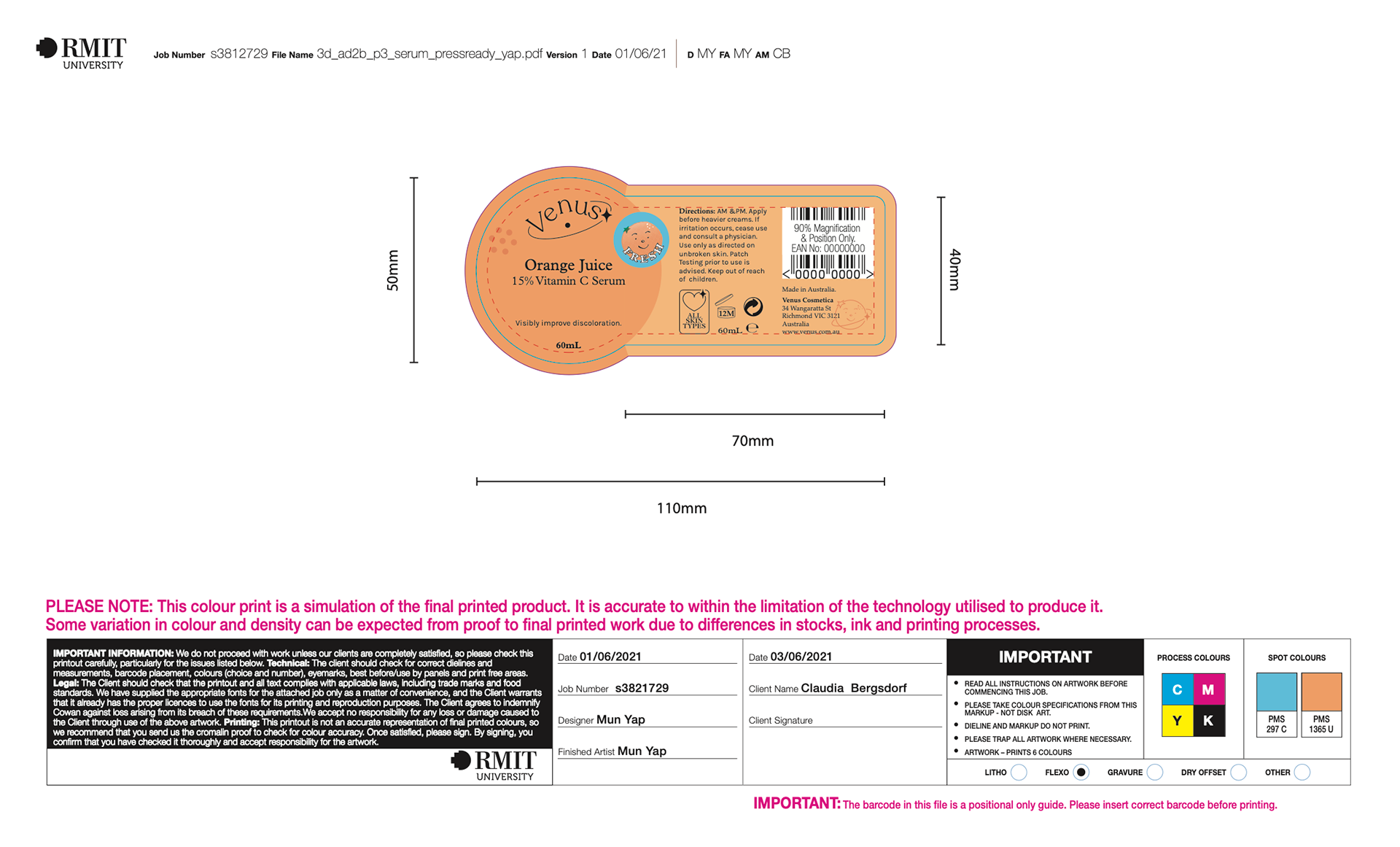
serum die-cut label finished art.
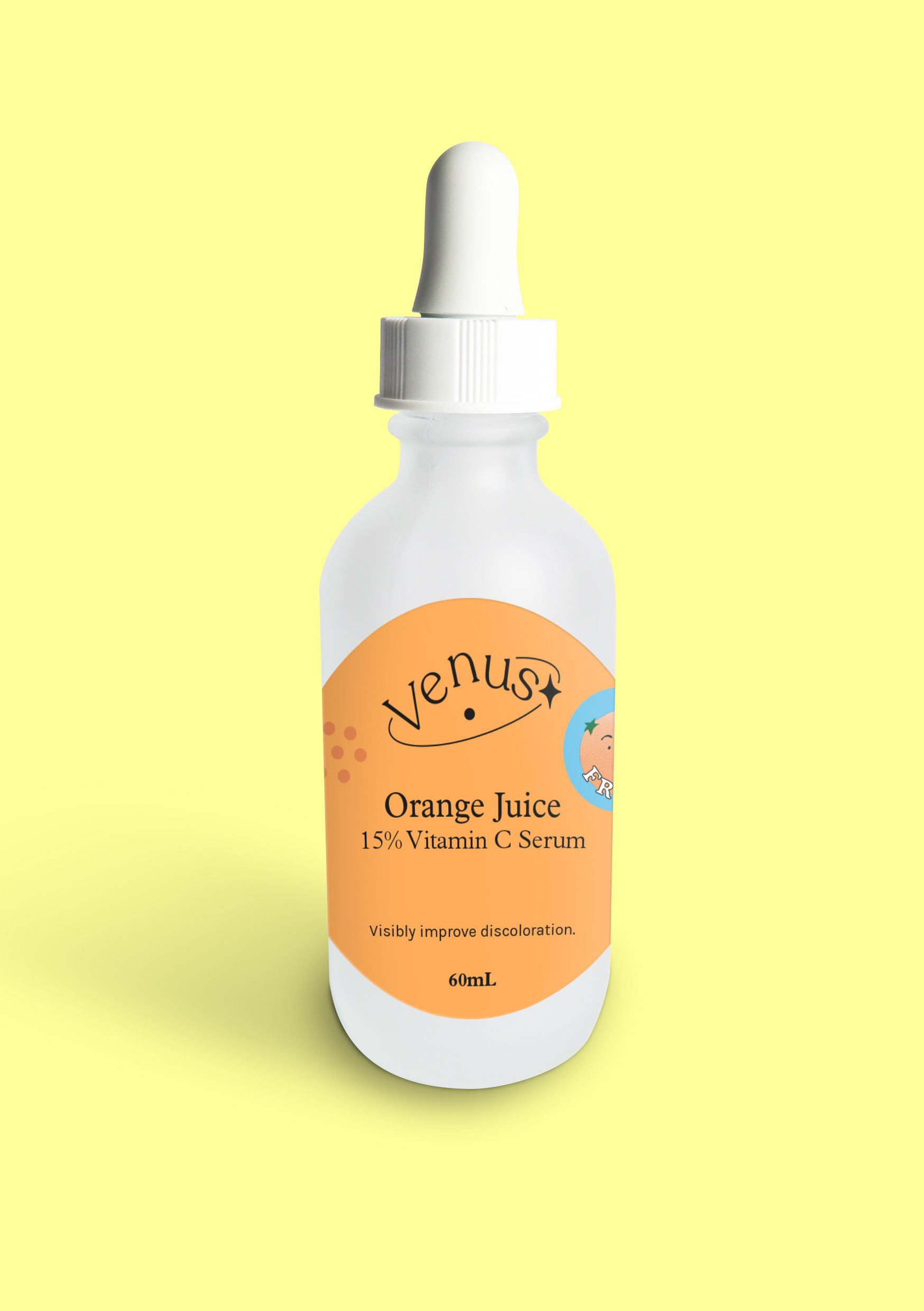
serum packaging mock-up.