
Poster #1: "Where are you really from"
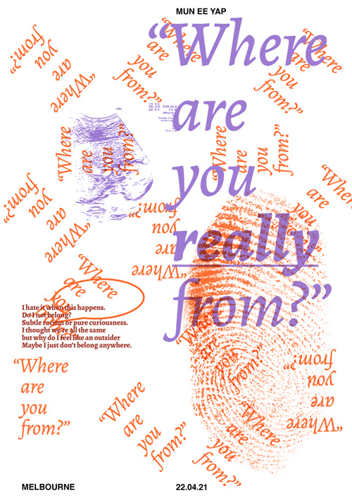
This piece aims to reflect the identity conflict experienced by people of colour, racism and discrimination. The phrase "Where are you from? Where are you really from?" is a question that people of colour always had to deal with and are probably sick of hearing, I tried to depict this by repeating the phrase, following the Patrick Thomas Grid and a bigger type size to emphasise the question that usually follows when the asker does not get the answer they were expecting.
I chose an Emotional sans type like Alegreya as this statement delves into ones identity which is a personal issue. Contrasting colours of orange and purple were used to depict the conflict in identity. An image of an ultrasound scan is added as a sarcastic appeal, with the meaning of being from a mother's womb. The thumbprint adds texture to the poster while depicting identity. Additional text were added to add emotional context to the poster.
POSTER #2: SEEING IS NOT ALL BELIEVING

This statement came from the power of celebrity influence, reflecting upon the trustworthiness of the media, warning people to not be vulnerable, believing all they see through the screen and fall into market schemes.
I've chosen to use a Rational sans type like Interstate as I believe this statement also appeals to ones rational sense. The layout of the text, words broken up in zigzags/random manner in attempt to reflect how the vulnerable and naive are bewitched in such marketing schemes. The text " is not all" is inverted as if a reflection in a mirror which is not reality.
Colours used in this poster are red and green, depicted the blindness of the vulnerable. This is emphasised with the repeated poster element of a blind head facing the television graphic. Modular shape of splatter, is used to depict the influence of the media and the swirl graphic shows how the vulnerable are "brainwashed".
POSTER #3: IMPORTANCE OF BRANDING
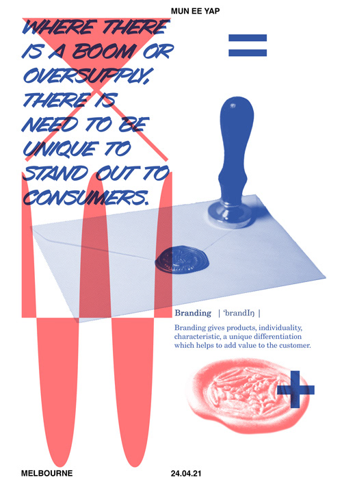
This piece is about the importance of branding in an oversupplied, boom market.
Images of a wax seal and stamp are used to represent branding. Graphic element, shapes are inspired by the oversupply (supply-demand) graph, booms and bust graph, addition and equal symbol, inspired by the context of the chosen texts; "where there is a boom or oversupply..." and "...add value to the customer".
I chose to use a progressive display type–Avalanche which is like a marker writing found in grocery store signs to symbolise the market aspect of the context. As this statement is like a finding, a theory which leads to an analysis, it is supported with a secondary text that is a dictionary type introduction to the theme of Branding. The secondary text displayed like a dictionary definition is in an understated serif, New Century Schoolbook Roman.
POSTER #4: OPPORTUNISTS ARE EVERYWHERE
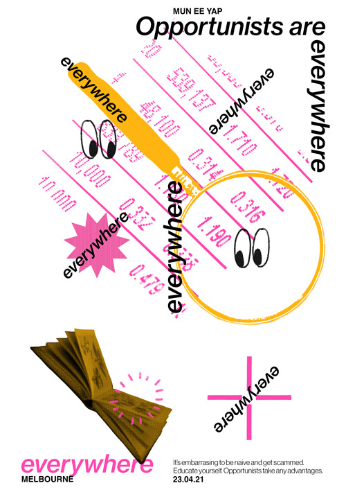
I have chosen a Progressive sans type like Neue Haas Grotesk. The word "everywhere" is repeated to simulate the visual imagery of the word, literally everywhere. The scattering of the repetition of the word “everywhere” is also like an echo emphasising to the reader to beware of opportunists.
Graphic elements include digital number figures from a stock market screen, symbolising the money driven opportunists, a magnifying glass and looking illustration, depicting the opportunist looking for a vulnerable target or a gap in the market to take advantage off. This is emphasised in the target graphic pointed on the text, "everywhere" on the bottom right.
The poster also embodies the importance to educate oneself in order to not fall into opportunists' traps.