YEAR: 2021
*T/N: THIS IS A STUDENT PROJECT.

packaging design finished art

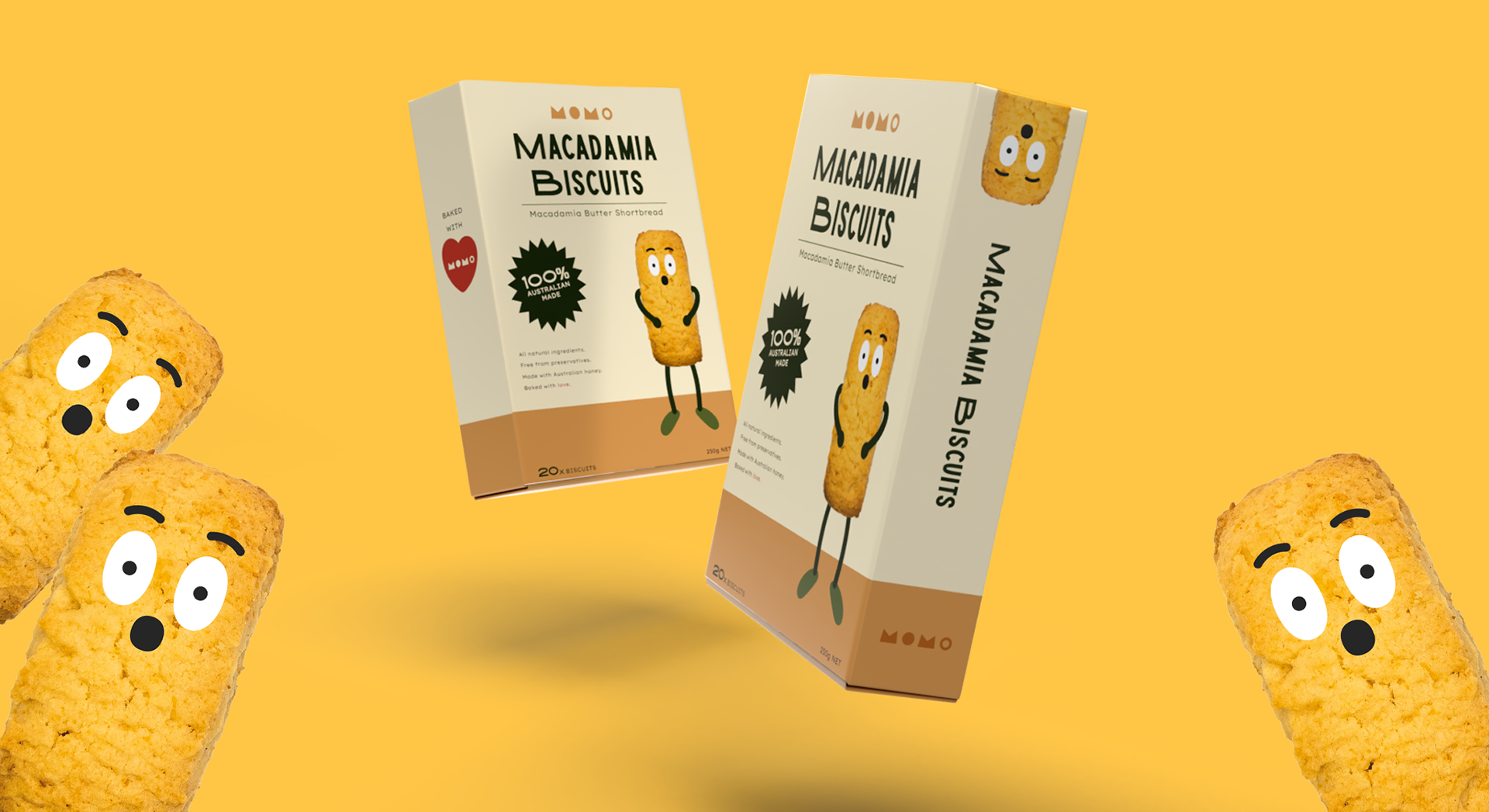
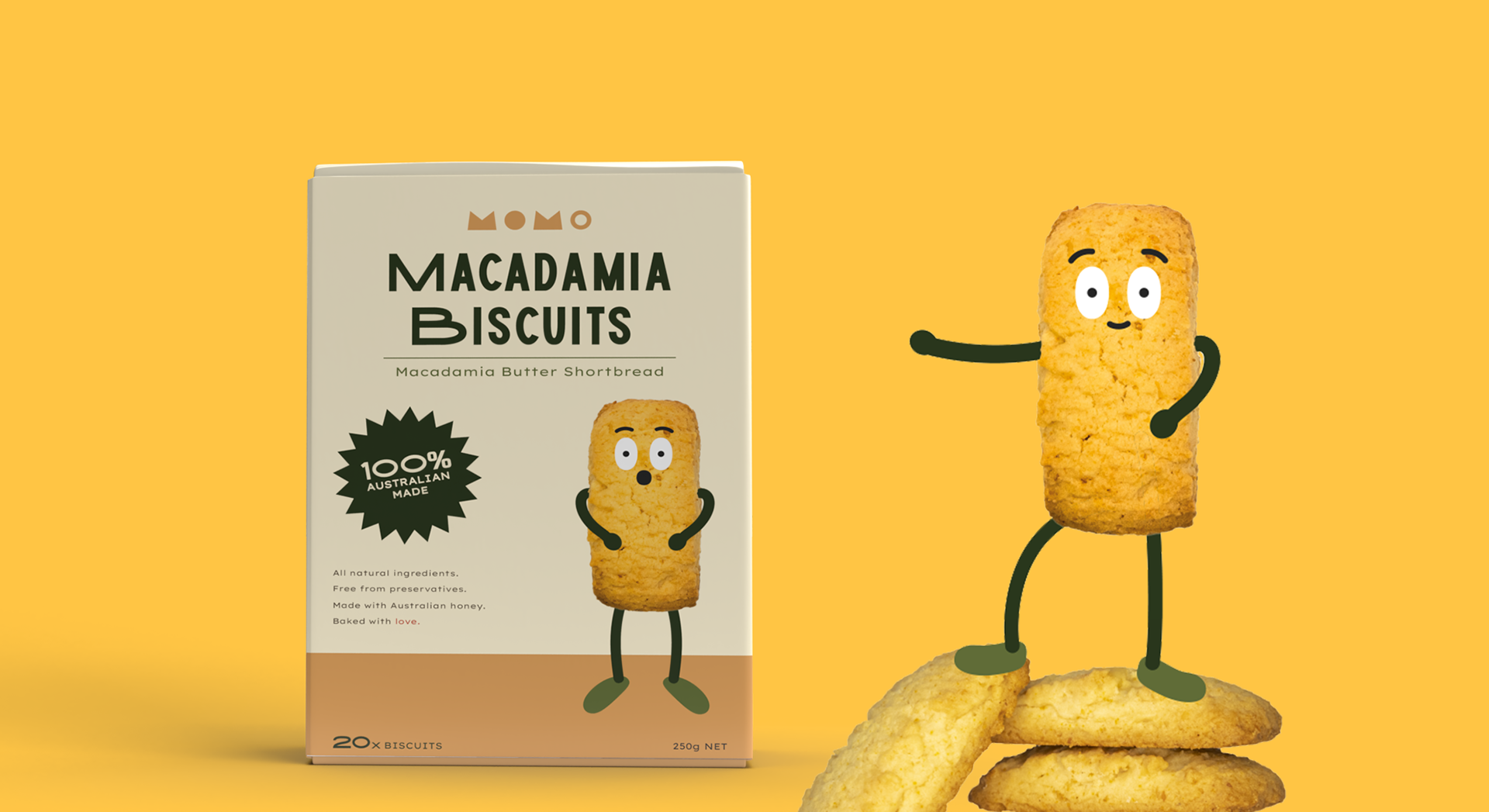
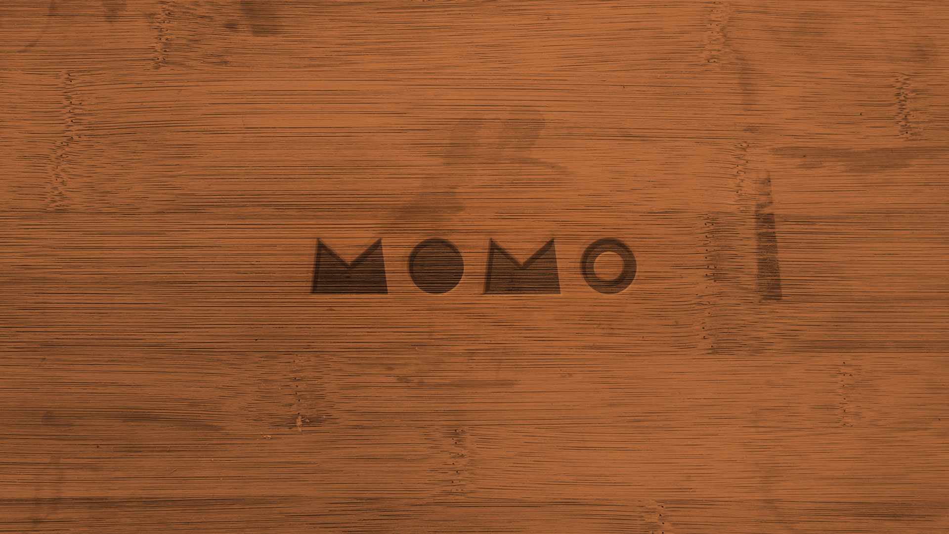
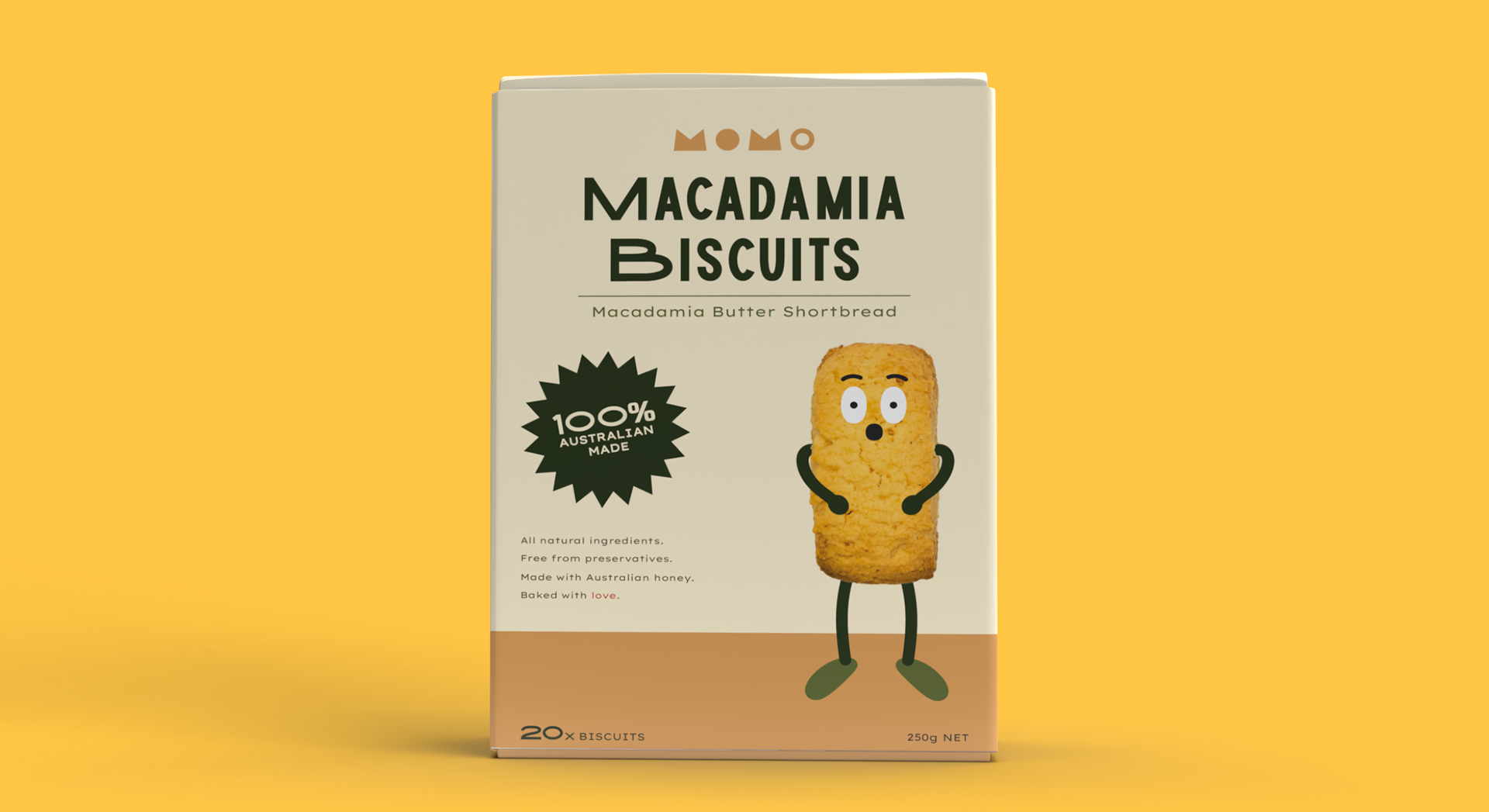
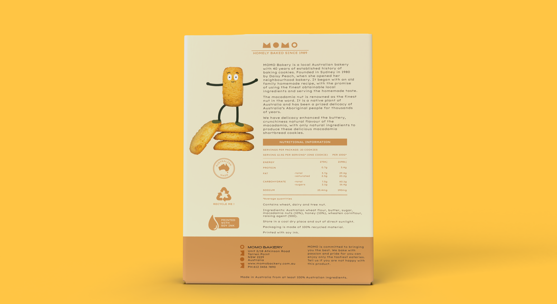
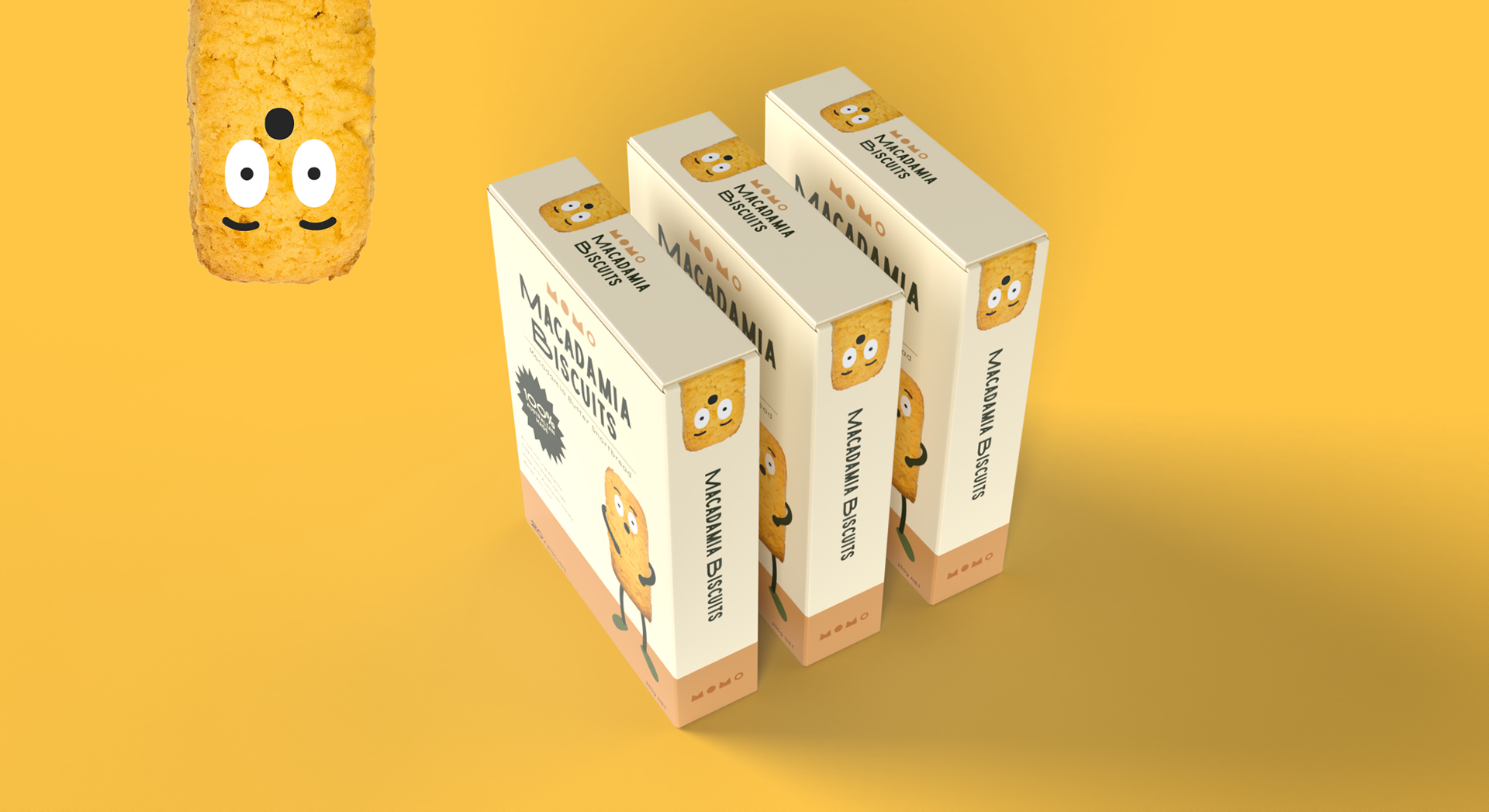
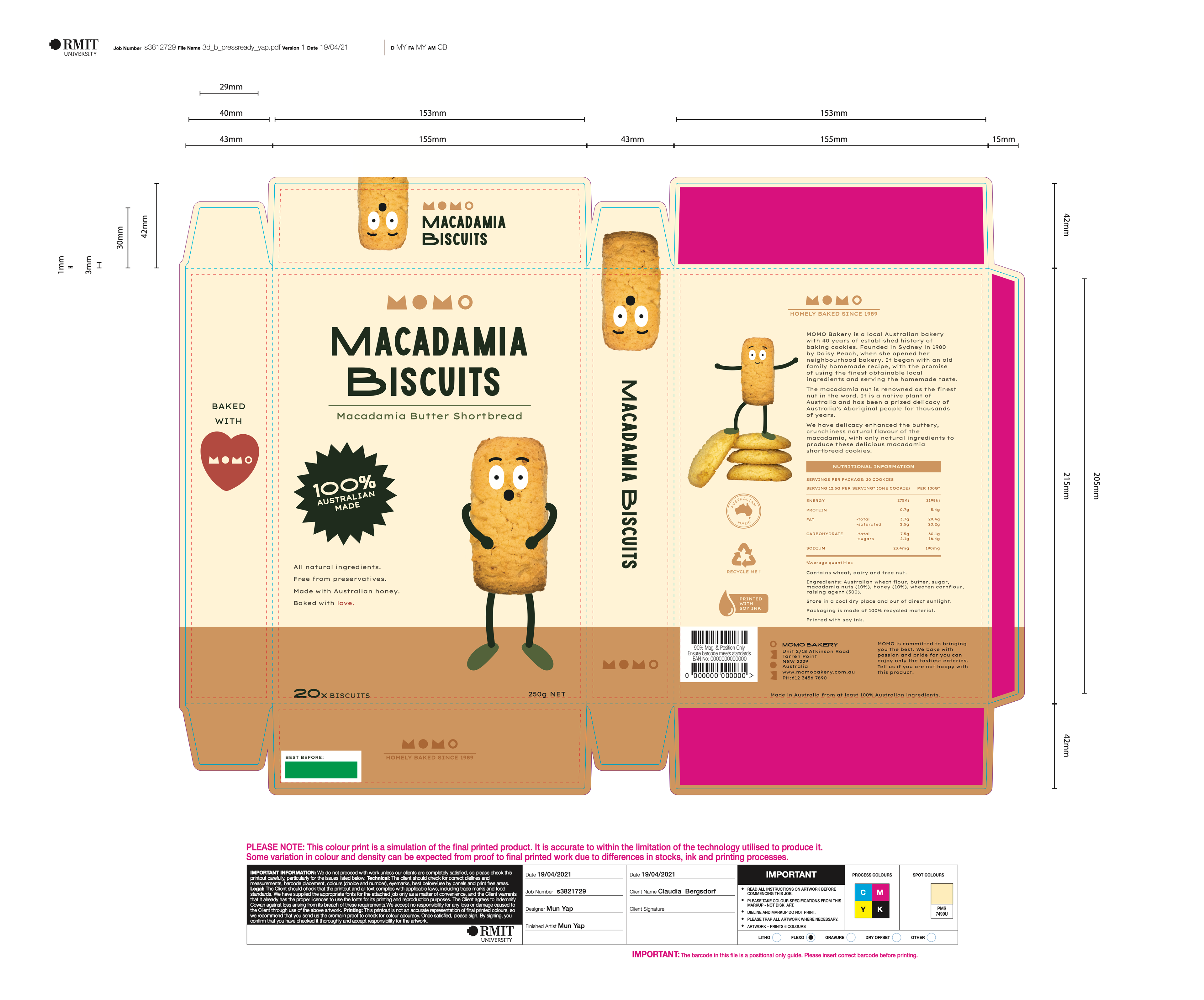
The project involved to create a packaging for MOMO Bakery, a local Australian bakery with 40 years of establish history of baking cookies, as they plan to diversify into the retail food industry carrying the name “MOMO”. The new retail product, Macadamia Biscuits is a low premium product that positions itself in line with the brand essence of, “Fun, Local, Homely Baked” . In order to ensure that the packaging reflected the brand essence, research on the current market, brand and target audience were conducted and feedback was constantly sought from the client. The new MOMO logo is contemporary, fresh and fun, suiting the target demographic and reflects the essence of the brand. It is simple and geometrically based, using basic shapes like a kids toy building block to reflect the nostalgic aspect of the brand – family baking. The final packaging design features an hero image of the product characterised in a fun, vintage cartoon, contemporary way. Warm colours, inspired by nature and the product flavour (macadamia) were used to appeal to target audience emotions of nostalgia, warmth, homely. The typography used is contemporary, sans serif, giving the premium product feel. Custom logos were also created to depict its sustainable, local positioning. Product image used was self generated, photograph taken using the original product of the original packaging. Then, edited with Adobe Photoshop's Camera Raw Filter. Limbs and faces were drawn on in Adobe Illustrator to cartoonise. Mock ups created on Adobe Dimension.
packaging design finished art